branding + creative strategy
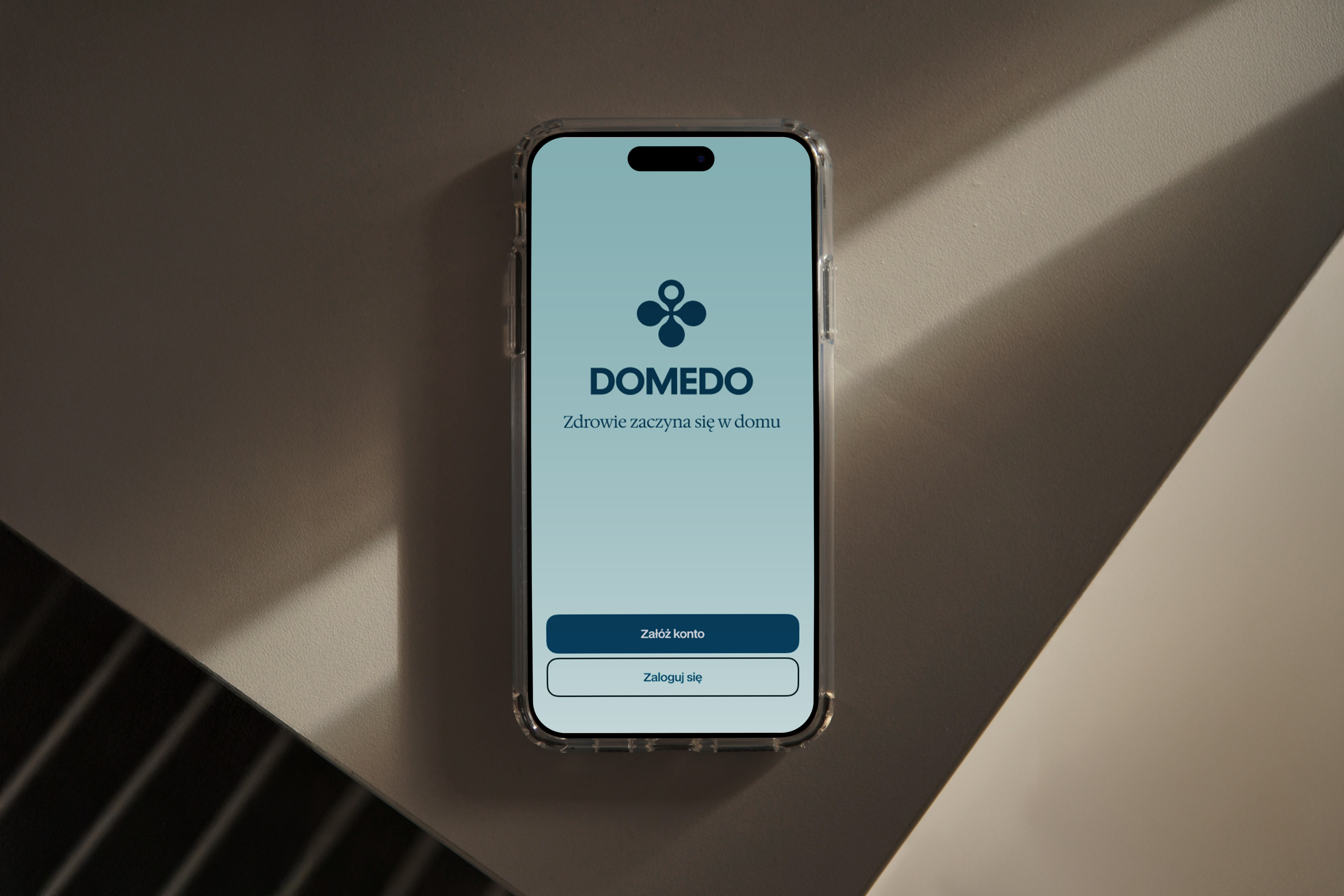
Domedo
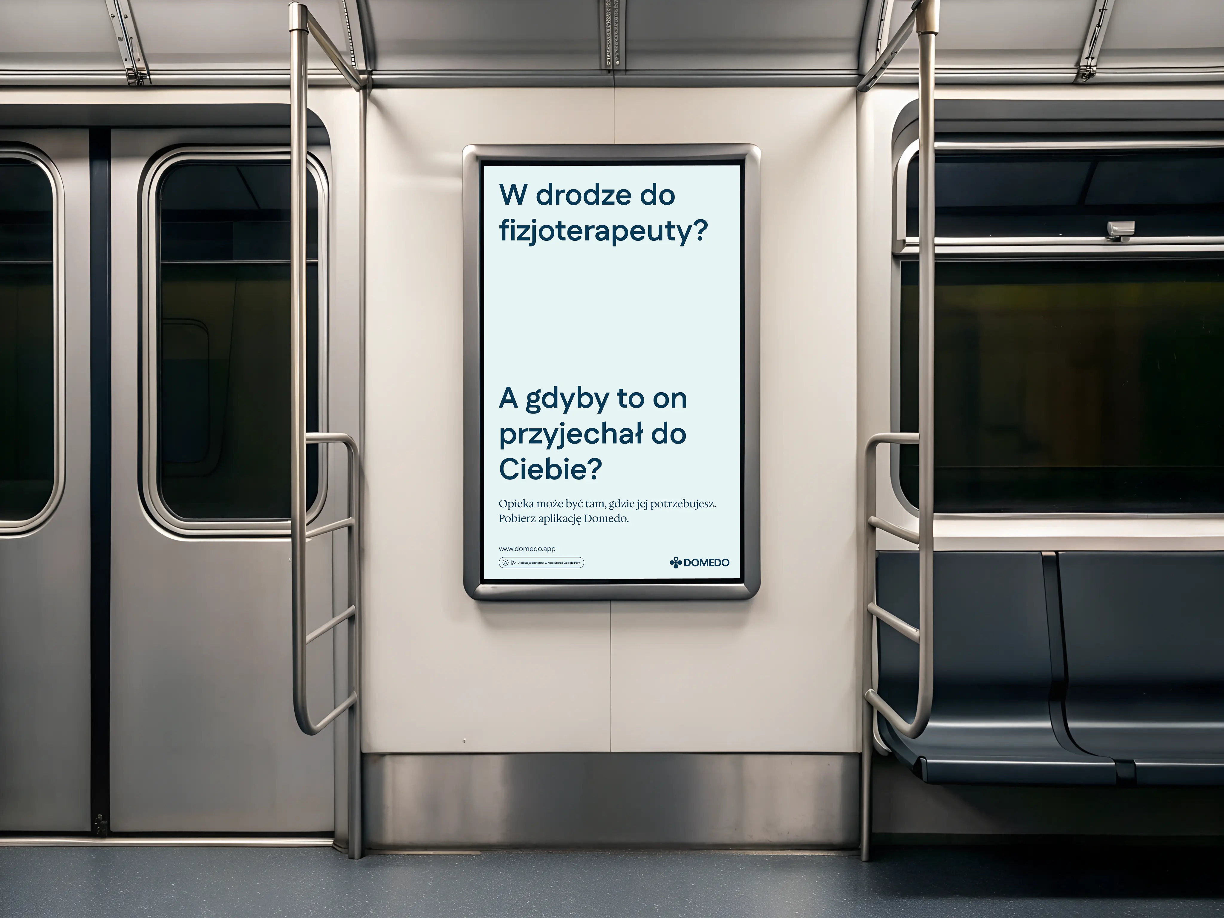
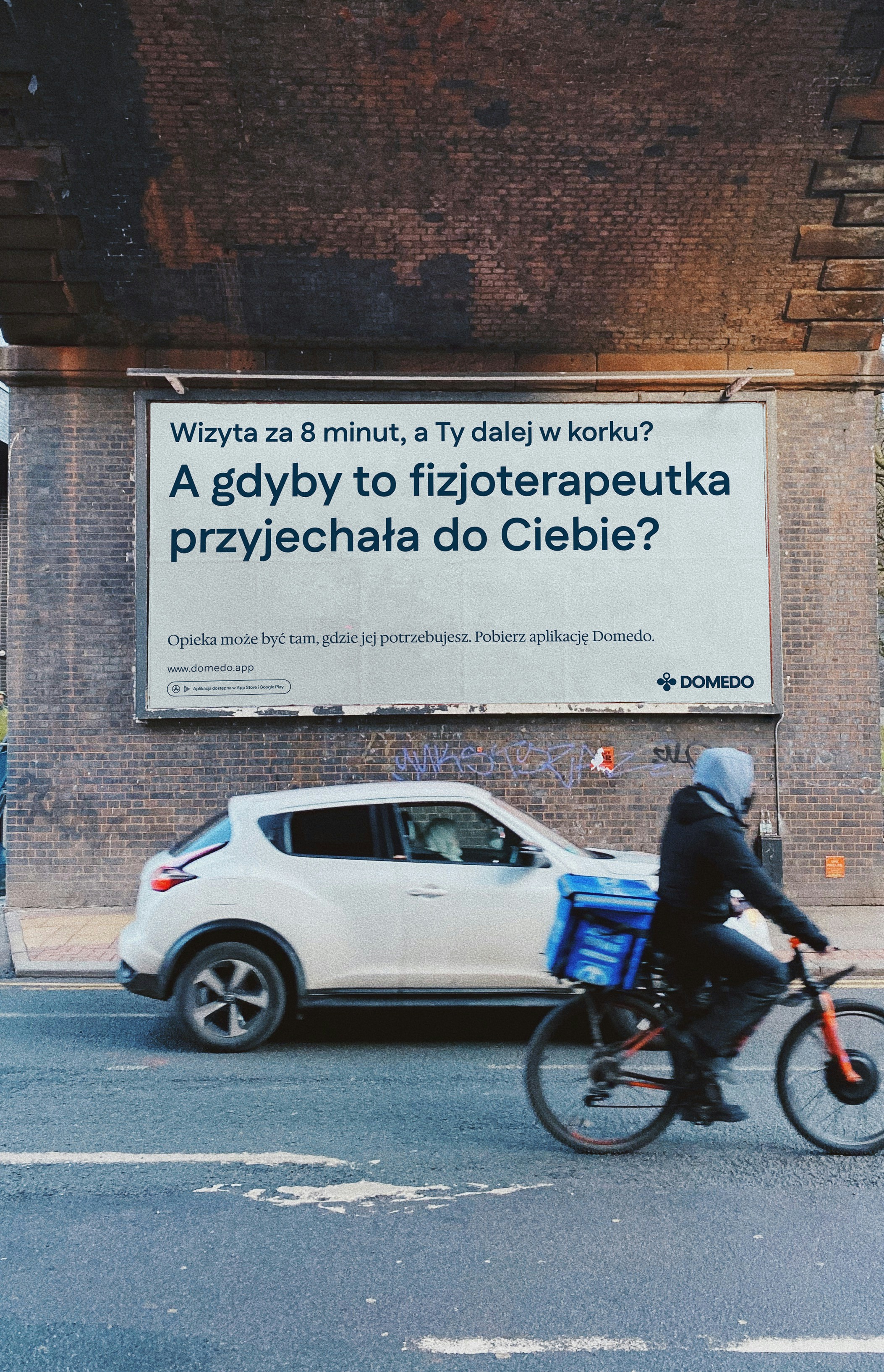
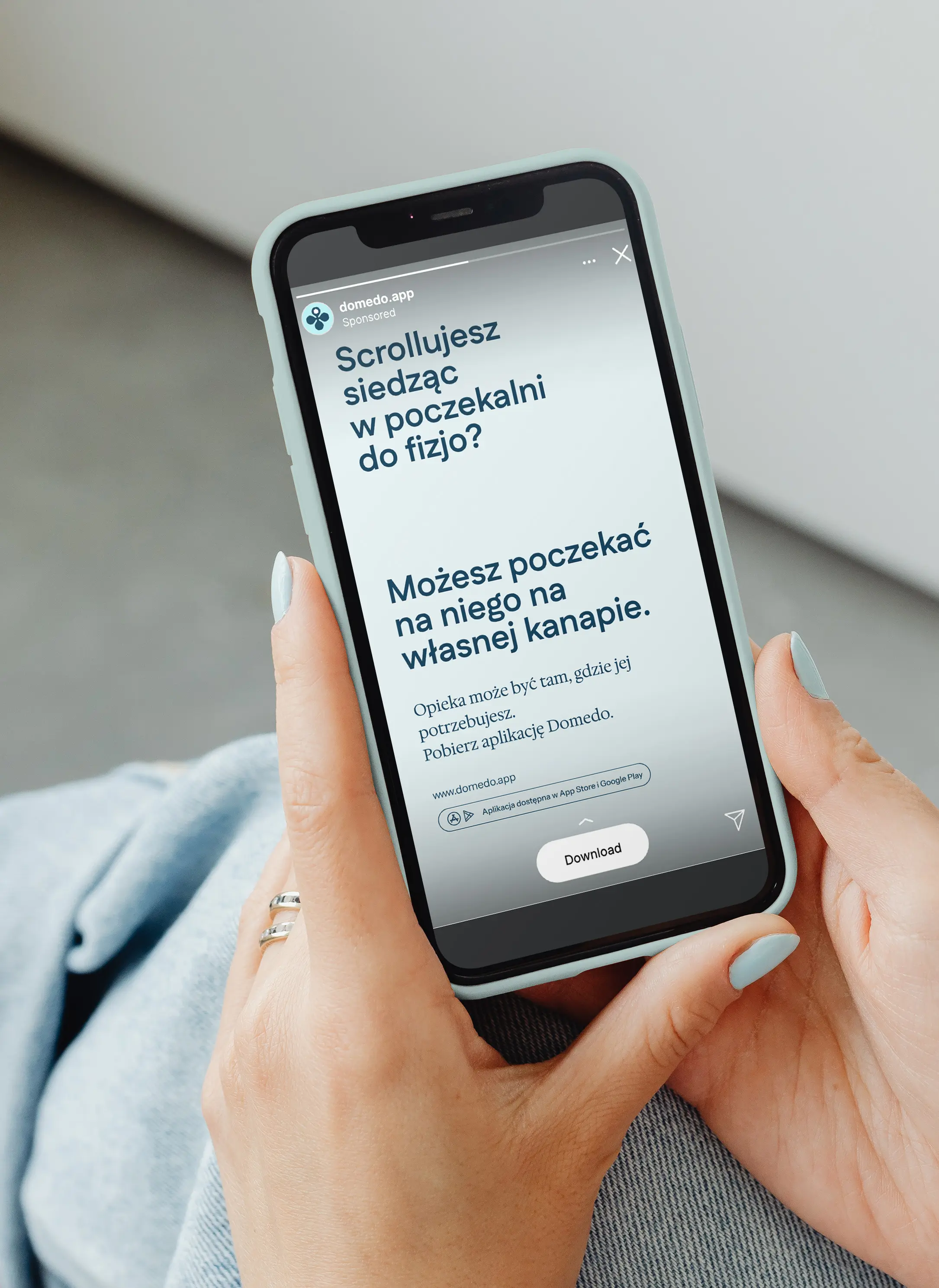
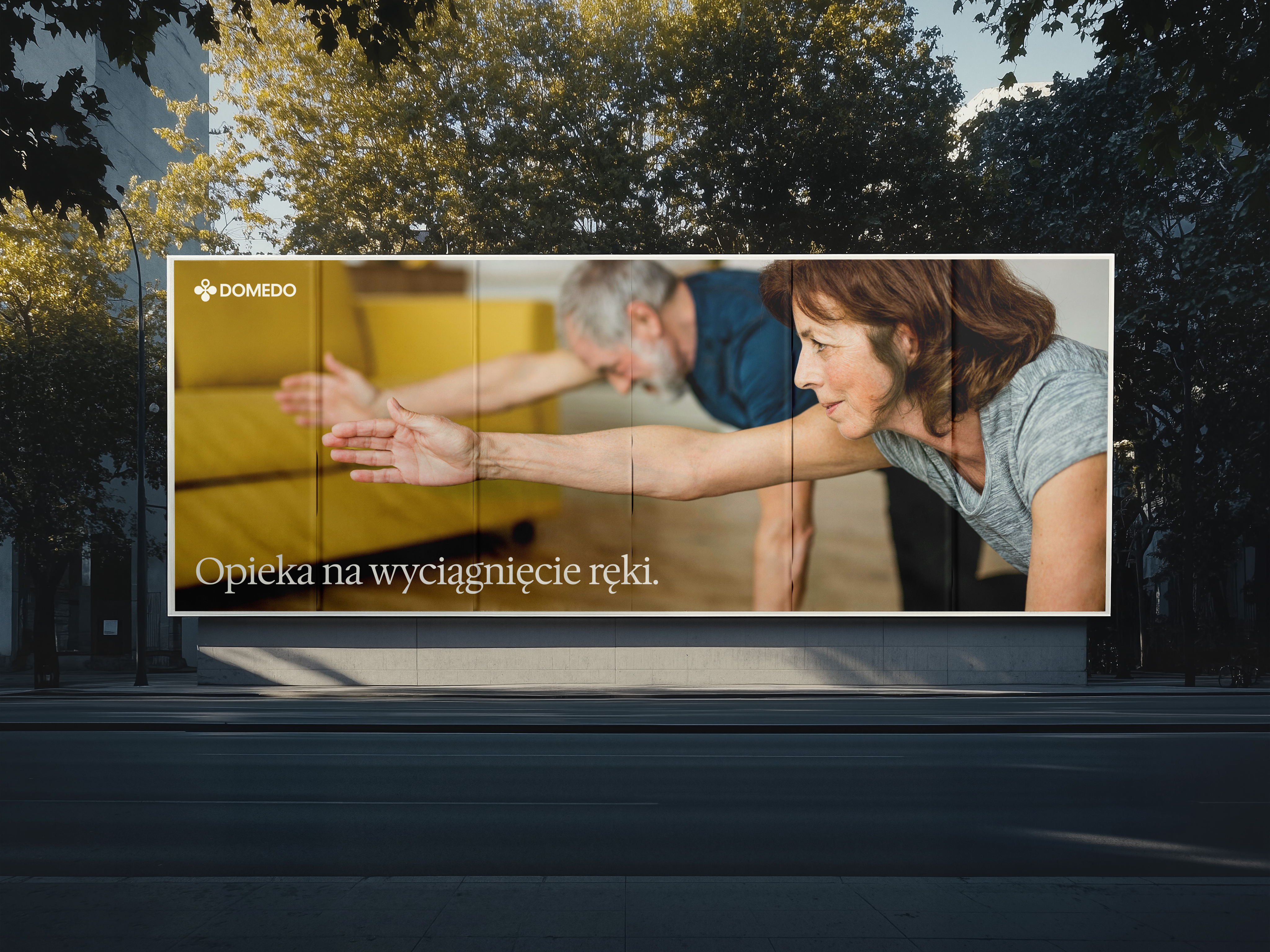
Accessing healthcare is rarely just a logistical task. It’s emotional.
It comes with stress, uncertainty, responsibility - often not just for yourself, but for someone close to you. And yet, most healthcare brands communicate in a way that feels distant, technical, and transactional. Domedo set out to change that.
The goal was to create a brand that makes professional care feel more accessible, more human, and more integrated into everyday life - without losing credibility or trust.
The project resulted in:
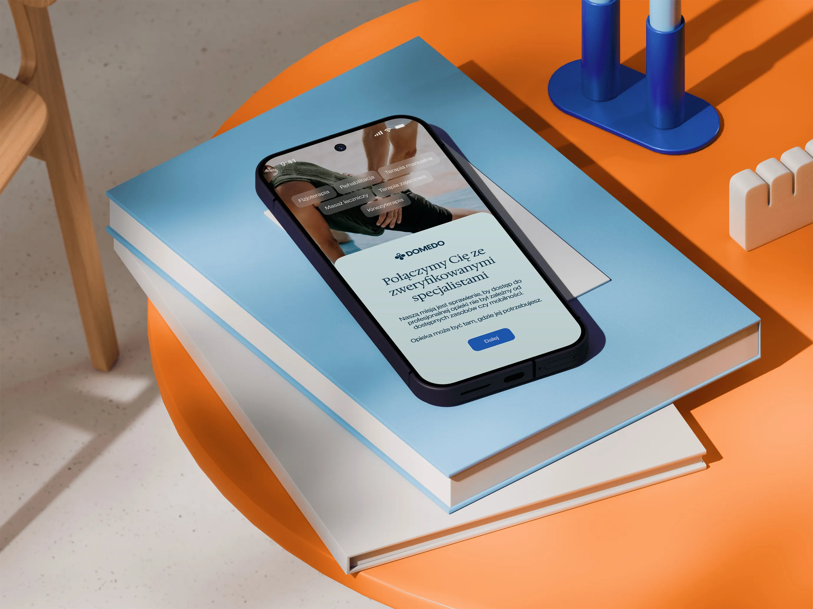
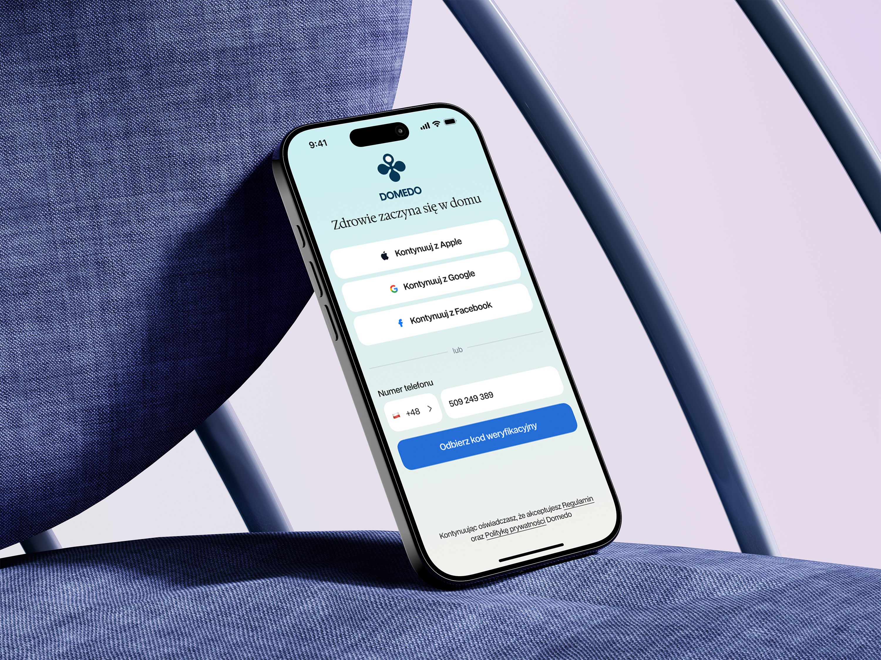
brand identity / brand & communication strategy / brand guidelines / logo design / tone of voice guidelines / ATL campaign concept, copy & art direction / social media templates / conference stand design