The Challenge
Gen Z consumers are increasingly interested in mental wellbeing, but often feel alienated by wellness brands that are overly serious, preachy, or filled with empty motivational clichés.
The goal was to create a brand that could talk about emotions, self-reflection, and everyday struggles without sounding like therapy, coaching, or another self-help guru.
The experience needed to feel approachable, relatable, and even a little absurd, reflecting the reality of modern life rather than an idealized version of it.
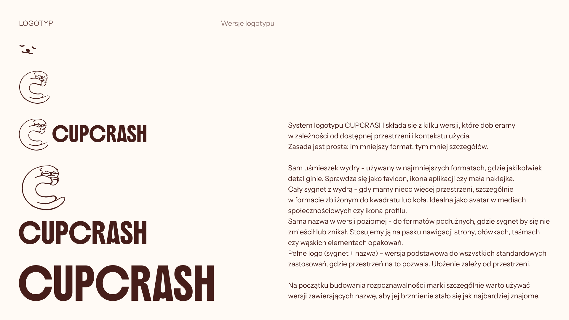
Excerpt from the brand book, presenting the logotype usage
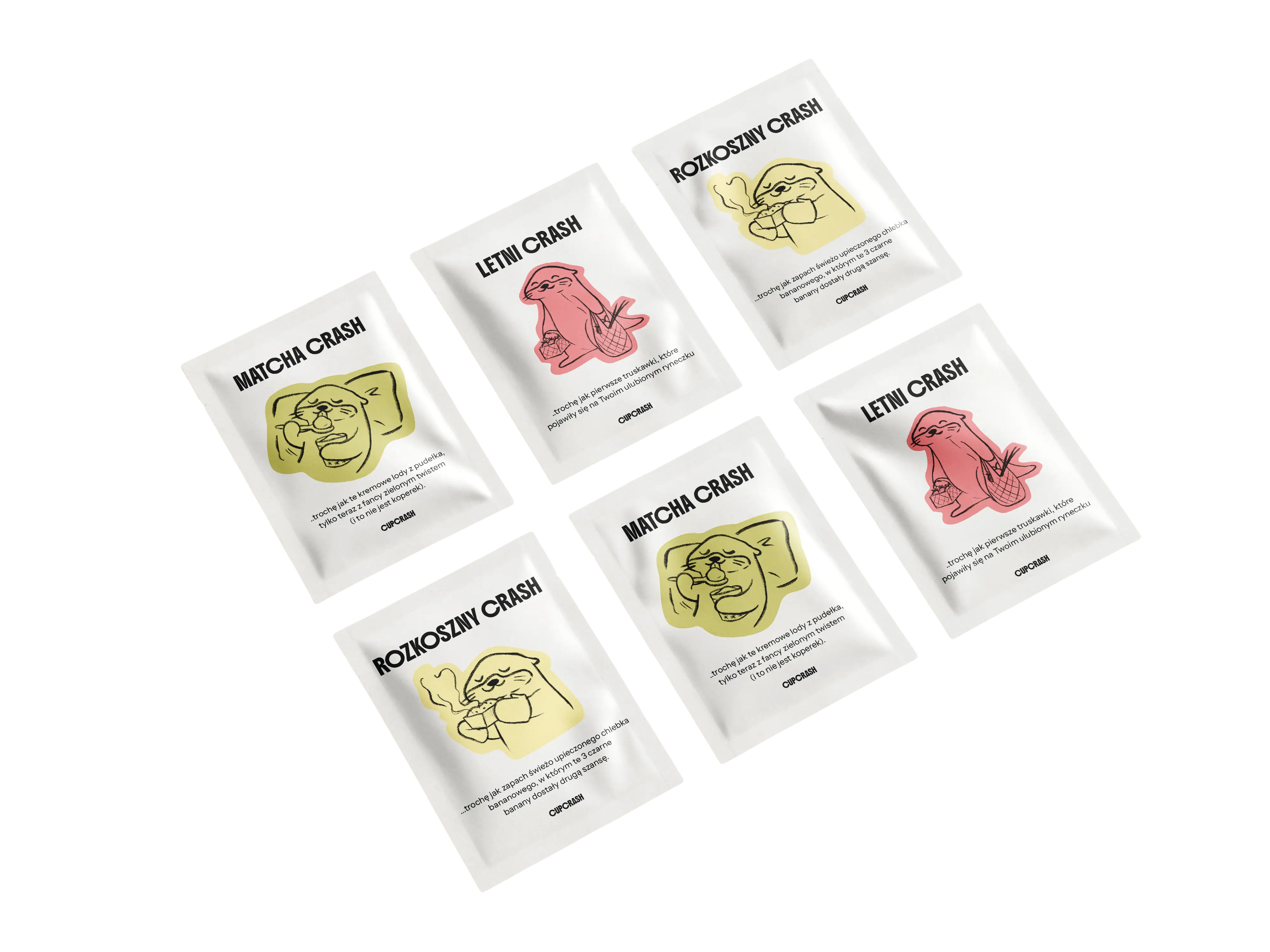
The otter mascot became the emotional heart of the brand. Drawn in a loose, sketchy style that deliberately avoids perfection, she appears across packaging and communication in situational illustrations that mirror the tea's flavor or the collection's theme. Her expressions do the heavy lifting — dot eyes, a :3 mouth, and a face that says "yeah, same" without a single word.

The Solution
The identity is built around the idea of interruption.
Every element of the brand is designed to gently disrupt automatic thinking patterns: from the product concept and copywriting to the visual language and packaging system.
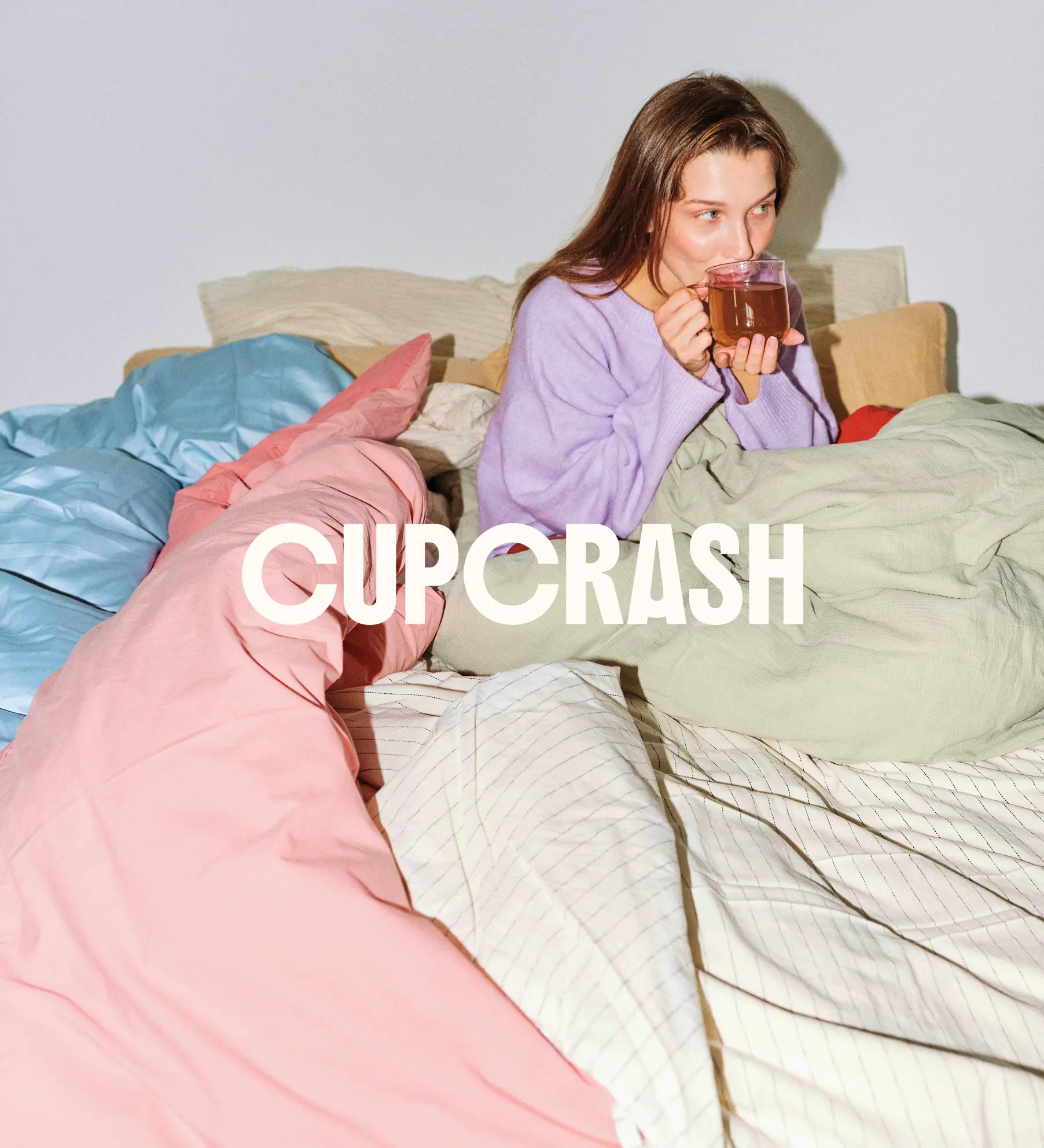
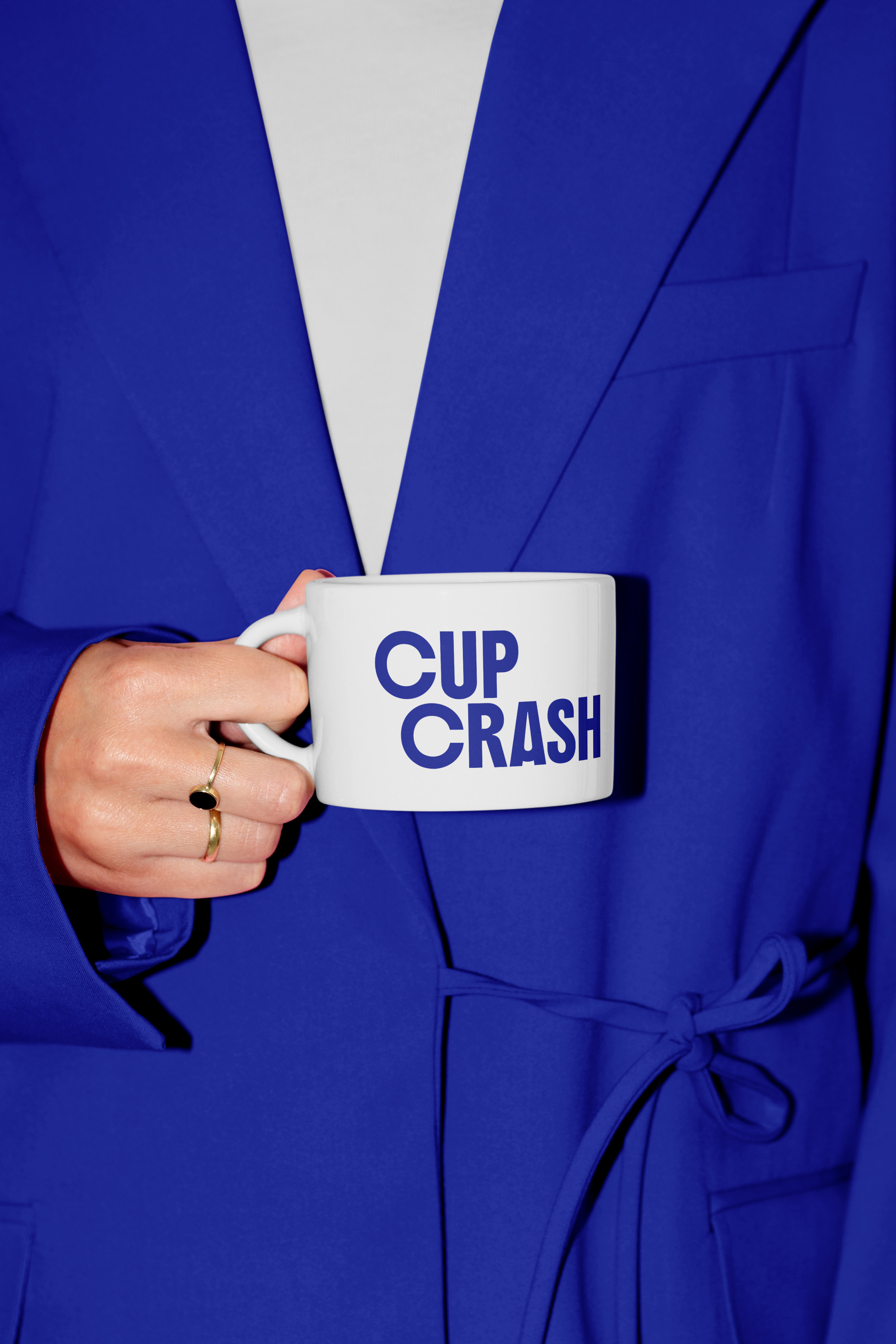
The brand combines playful illustrations of an expressive otter mascot, handwritten elements, imperfect shapes, and soft colors inspired by comfort, nostalgia, and everyday rituals.
Each tea collection explores a different theme, such as family expectations, work pressure, relationships, or overthinking. Every sachet includes a short prompt card. One side presents a familiar thought, pressure, or belief, while the other offers an alternative perspective, encouraging reflection without prescribing a solution.
The brand identity was built around four core values: authenticity, presence in everyday life, freedom from pressure, and a healthy distance from the absurdity of modern life. Every visual decision was filtered through these - nothing was allowed to feel too polished, too motivational, or too serious.
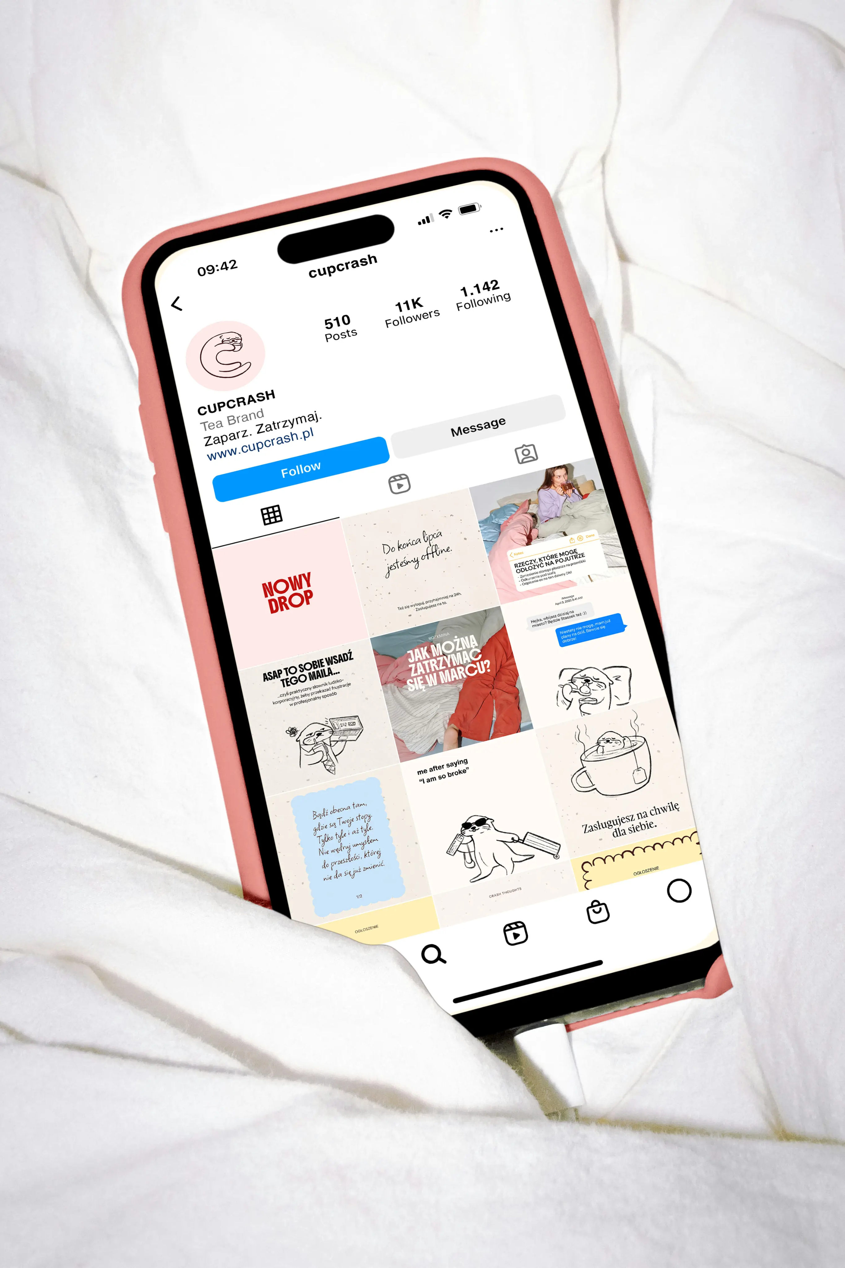
Proposal of social media feed - color palette, typography, layout and illustration all put into use.
Tea is packaged into differently themed boxes - each corresponding to a different life issue: overthinking, nostalgia, corporate life etc.
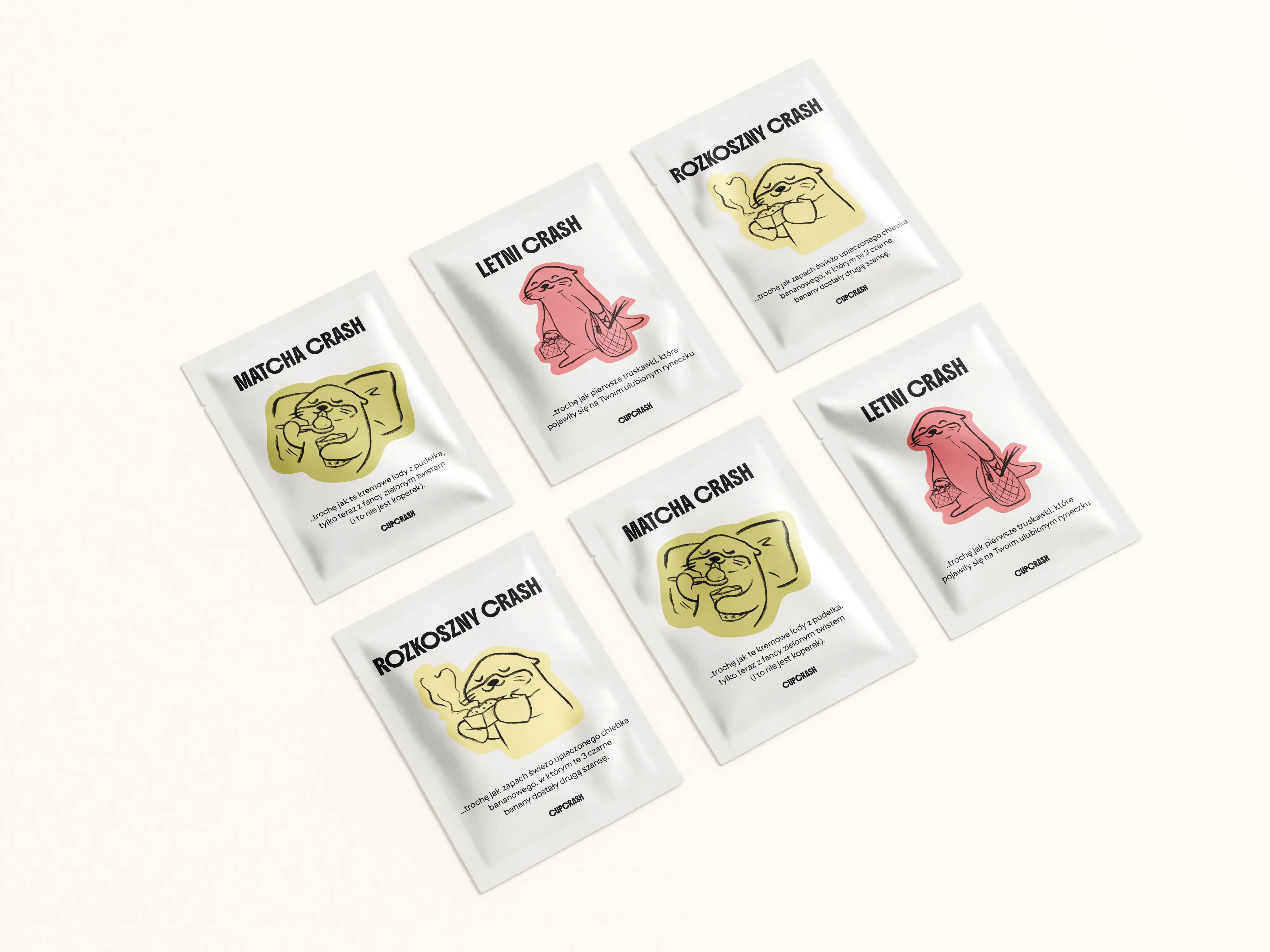
Each tea bag has a holding piece of paper attached with two sides - one with a triggering thought, and the other one offering a more constructive perspective on the same issue.
Like what you see?
Together, we could create something even better - something truly yours.