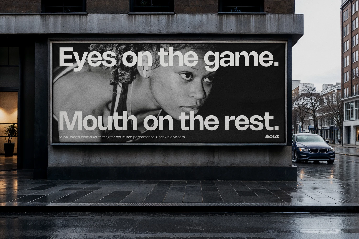
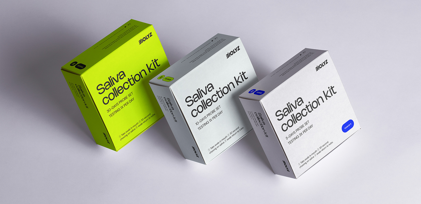
An Austrian-German start up developed a cutting-edge diagnostic solution. A painless saliva swab replaces blood draws and finger-pricks. Athletes can now collect a sample in the changing room in under a minute, ensuring clinical-grade precision while slashing reagent costs.
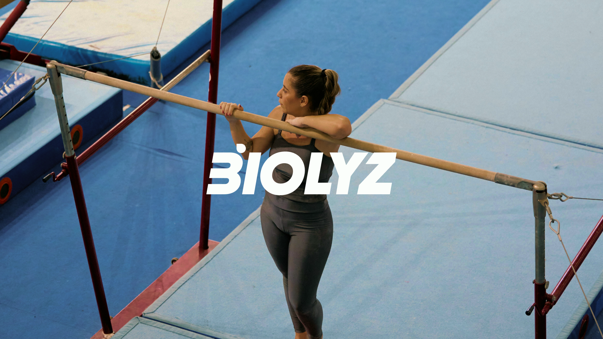
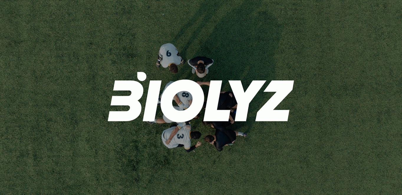
Biolyz stands for performance optimization, injury prevention, faster recovery, objective training load management, all this combining humane approach with competitive edge.
Biolyz speaks to real people - not data points.
While precise and science-based, they never forget that all they do should help improving someone’s health and career.
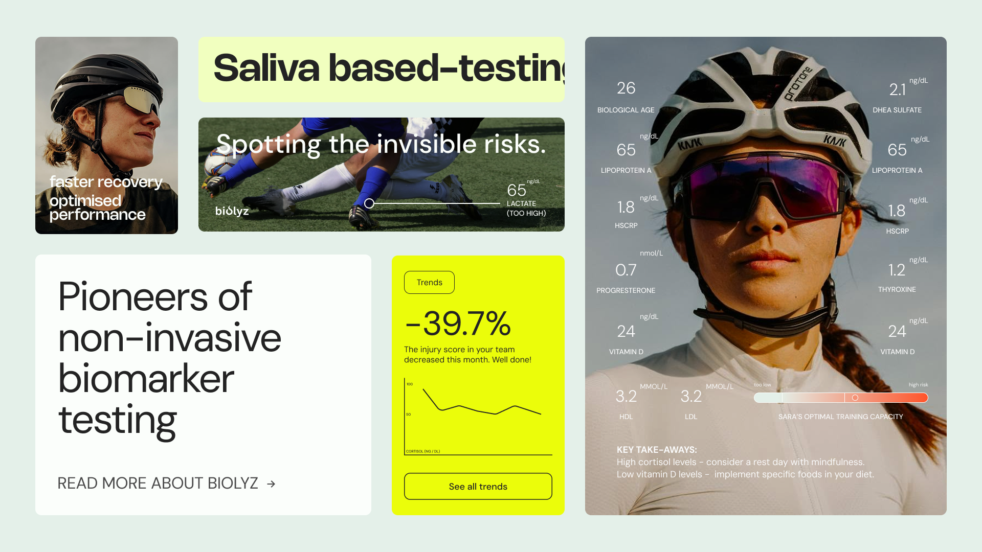
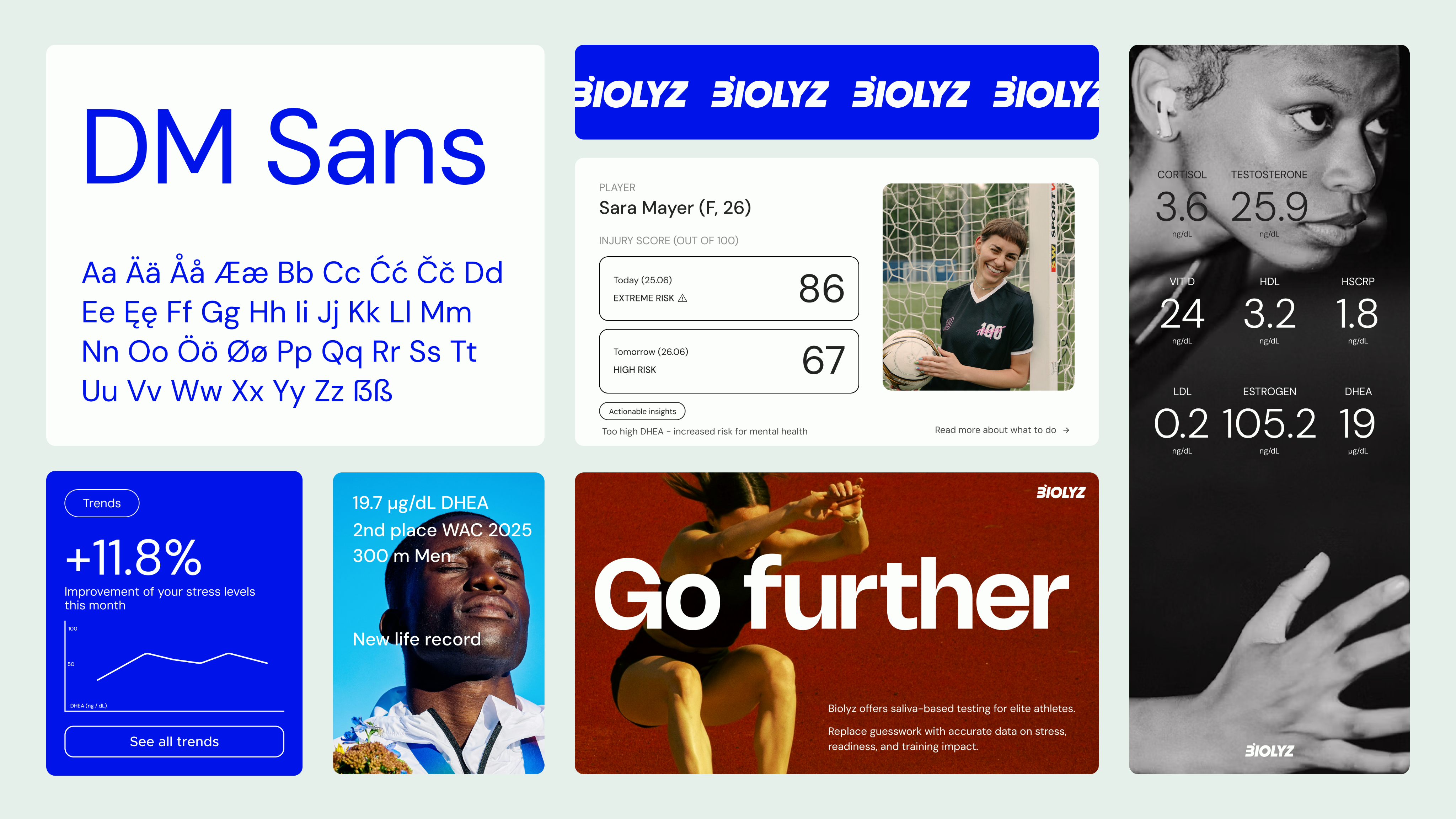
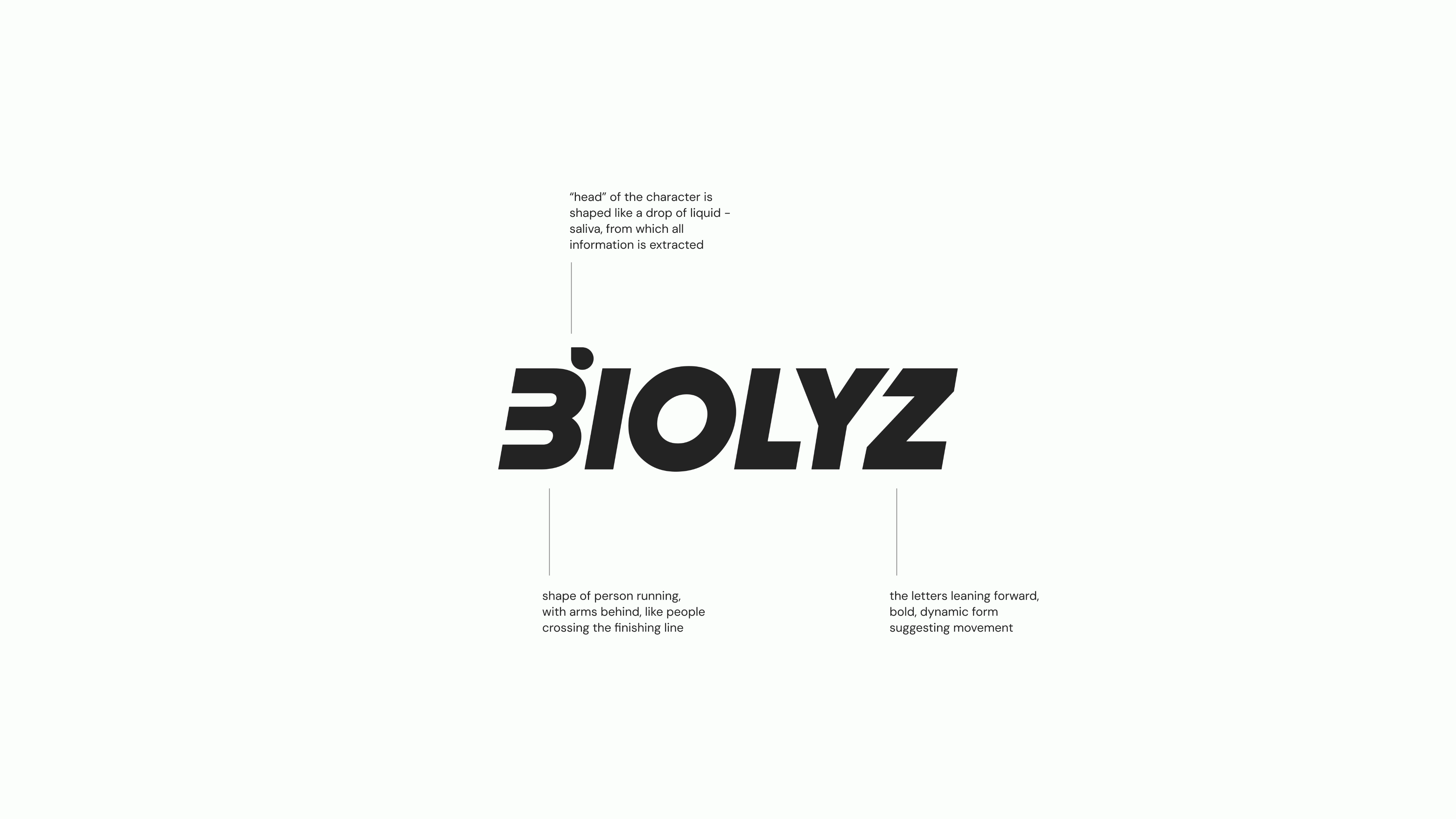
After carefully examining the values and business goals of the company, we developed a communication strategy, a new visual identity and a website (developed by Semiflat) reflecting what Biolyz stands for.
The deliverables included:
brand identity / brand & communication strategy / brand guidelines / logo design / set of illustrations / tone of voice guidelines / website design / ATL campaign concept, copy & art direction / social media templates